
After a period of minimalist flatness, gradients are making a powerful visual comeback, redefining how we perceive depth, light, and dimension in modern design. Far from the jarring, early digital iterations, today’s gradients are sophisticated, nuanced, and dynamic, infusing designs with energy, emotion, and a captivating sense of fluidity. From subtle background washes that enhance user interfaces to bold, vibrant transitions that dominate branding and art, the re-emergence of gradients signals a shift towards richer, more expressive aesthetics. This comprehensive article delves into the burgeoning popularity of gradients, exploring their cyclical historical presence, the psychological impact they wield, and their diverse manifestations across various design disciplines. We’ll uncover how designers are masterfully leveraging these versatile color blends to craft compelling, memorable, and visually rich experiences that resonate deeply with contemporary sensibilities.
A Historical Perspective on Gradients
The use of gradual color transitions in art and design is not a new phenomenon; it’s a recurring visual device that has evolved significantly alongside technological and artistic movements.
A. Renaissance Chiaroscuro and Sfumato: Long before digital tools, master painters like Leonardo da Vinci employed techniques like sfumato (soft, subtle blending of colors and tones, often creating a misty or hazy effect) and chiaroscuro (strong contrasts between light and dark, usually bold, to give a three-dimensional effect) to create depth, realism, and dramatic mood in their works. These were early forms of natural, hand-blended gradients.
B. Impressionism and Atmospheric Effects (Late 19th Century): Artists like Claude Monet focused on capturing the fleeting effects of light and atmosphere, often using subtle shifts in color to depict changing times of day or weather conditions, creating a sense of ethereal transition.
C. Art Deco and Airbrush Art (1920s-1930s): The Art Deco era saw the rise of airbrush techniques, which allowed for smooth, precise gradients and shading in illustrations and commercial art. These often created a sense of sleekness, modernity, and glamor, particularly in automotive and advertising designs.
D. Psychedelic Art (1960s-1970s): Fueled by counter-culture and experimental mindsets, psychedelic art embraced vibrant, often clashing, color gradients to create swirling, hypnotic, and otherworldly visual experiences, reflecting a sense of freedom and altered perception.
E. Early Digital Graphics and Web Design (1990s-Early 2000s): With early graphical user interfaces and web browsers, gradients became a prominent feature. Simple linear and radial gradients were used to add depth to buttons, create background textures, and simulate 3D effects. However, often constrained by limited color palettes and rendering capabilities, these gradients could sometimes appear banded or unsophisticated. The “Web 2.0” era, in particular, saw an explosion of glossy, often overused, gradients for buttons and logos.
F. Minimalist Backlash (Late 2000s-2010s): A reaction against the perceived visual clutter of early digital gradients led to a strong minimalist movement, favoring flat design, solid colors, and stark simplicity. Gradients largely fell out of favor during this period, considered dated or overly decorative.
This historical journey reveals a cyclical pattern where gradients emerge when designers seek to add depth, richness, and dynamic visual interest, often tied to technological capabilities and prevailing aesthetic sensibilities. Their current comeback is informed by past lessons and enhanced by new tools.
The Psychological Allure
The renewed fascination with gradients isn’t arbitrary; it stems from their powerful psychological effects and their ability to address contemporary aesthetic desires.
I. Depth, Dimension, and Realism
A. Simulating Light and Shadow: Gradients naturally mimic how light falls on objects and surfaces in the real world, creating an illusion of depth, volume, and three-dimensionality, even on a flat screen.
B. Adding Visual Interest: Unlike flat colors, gradients provide continuous visual variation, keeping the eye engaged and adding a sense of dynamism to static designs.
C. Breaking Flatness: In a post-minimalist world, gradients offer a way to reintroduce subtle complexity and richness without resorting to excessive ornamentation, adding layers of visual information.
By adding perceived depth, gradients create more engaging and realistic visual experiences.
II. Emotional Resonance and Mood Setting
A. Evoking Emotion: Color transitions can powerfully convey emotion. A warm gradient (red to orange) might suggest energy or passion, while a cool gradient (blue to purple) could evoke calm or mystery.
B. Creating Atmosphere: Gradients are excellent for setting the mood of a space, product, or digital interface. A sunrise-inspired gradient for a “wake up” light, or a twilight gradient for a calming background, are examples.
C. Fluidity and Movement: The smooth transition of colors implies motion and flow, adding a sense of dynamism and fluidity that can make designs feel more alive and contemporary.
D. Subtle Storytelling: Gradients can subtly suggest concepts like progression, change, or connection, enhancing narrative elements in design without literal imagery.
Gradients act as a sophisticated emotional palette, influencing perception and mood without explicit messaging.
III. Modernity and Sophistication
A. Contemporary Aesthetic: Today’s gradients are far more refined than their early digital counterparts. They often feature complex color blends, subtle noise, and nuanced transitions, aligning with a modern, sophisticated aesthetic.
B. Innovation and Freshness: The intelligent re-application of gradients feels fresh and innovative, moving beyond the stark simplicity of pure flat design while avoiding the excesses of past trends.
C. Brand Differentiation: In a crowded market, unique and well-executed gradients can provide a distinct visual signature for brands, helping them stand out and convey a modern, dynamic identity.
D. Versatility: Gradients are incredibly versatile, applicable across a vast range of design contexts, from micro-elements to large-scale environments, consistently lending a contemporary feel.
The nuanced and intelligent use of gradients signals a sophisticated and forward-thinking design approach.
IV. Engagement and User Experience (UX)
A. Guiding the Eye: Gradients can subtly direct user attention to important elements or areas of an interface, creating a natural visual flow.
B. Feedback and States: In UI design, gradients can be used to indicate different states (e.g., active, hover, disabled) or provide visual feedback for user interactions, making interfaces more intuitive.
C. Visual Hierarchy: By varying the intensity or direction of gradients, designers can establish clear visual hierarchies, making complex information easier to digest.
D. Personalization and Customization: Gradients offer a simple yet powerful way to personalize digital interfaces or product aesthetics, allowing users to choose their preferred color transitions.
Gradients enhance user engagement by making interfaces more intuitive, dynamic, and visually appealing.
Gradients’ Dynamic Impact Across Design Disciplines
The resurgence of gradients is broad and pervasive, influencing how designers approach spaces, products, branding, and digital interfaces, creating compelling visual narratives.
I. Graphic Design and Branding
In graphic design and branding, gradients are being used to create distinctive, modern, and memorable visual identities that stand out.
A. Vibrant Logos and Wordmarks: Many contemporary brands are incorporating gradients into their logos, creating a sense of depth, dynamism, and modernity. These are often complex, multi-color blends that differentiate the brand.
B. Backgrounds and Textures: Gradients are widely used as backgrounds for websites, mobile apps, social media graphics, and print materials, providing a rich, atmospheric canvas that adds depth without distracting from content. Subtle noise or grain can be added for a tactile feel.
C. Typographic Enhancements: Gradients are applied to text to make headlines pop, create a sense of sophistication, or add a dynamic visual flourish to typographic compositions. This can range from subtle light-to-dark transitions to vibrant color shifts.
D. Packaging Design: Gradients are transforming product packaging, creating eye-catching designs that convey premium quality, evoke specific emotions (e.g., freshness, energy), and stand out on shelves.
E. Illustrations and Iconography: Digital illustrations and icons often feature subtle or bold gradients to add dimension, realism, and a more contemporary feel, moving away from flat illustrations.
F. Brand Storytelling: Gradients can be used to visually represent abstract concepts like growth, transformation, or connectivity, reinforcing a brand’s narrative through color transition.
Gradients in graphic design create a sophisticated, dynamic, and instantly recognizable visual signature for brands and communications.
II. User Interface (UI) and User Experience (UX) Design
Modern UI/UX design leverages gradients to enhance usability, visual appeal, and overall user engagement.
A. Backgrounds and Depth: Gradients provide subtle depth and visual interest to digital interfaces, making them feel less flat and more inviting. They can differentiate sections or hint at elevation.
B. Buttons and Interaction States: Gradients are used to add subtle realism and visual feedback to buttons, making them feel more clickable and indicating different interaction states (e.g., hover, pressed).
C. Visual Hierarchy: By varying the intensity or direction of a gradient, designers can subtly guide the user’s eye to important elements, improving navigation and information processing.
D. Data Visualization: Gradients are effective for representing continuous data, such as temperature maps, progress bars, or charts, allowing for a clear visual representation of change or intensity.
E. Onboarding and Delight: Smooth, engaging gradients in onboarding flows or loading screens can create a more pleasant and reassuring experience, reducing perceived waiting times and adding a touch of delight.
F. Branding within UI: Integrating brand-specific gradients into the UI provides a cohesive and branded experience across all digital touchpoints.
Gradients in UI/UX create more intuitive, aesthetically pleasing, and engaging digital interactions that enhance the overall user journey.
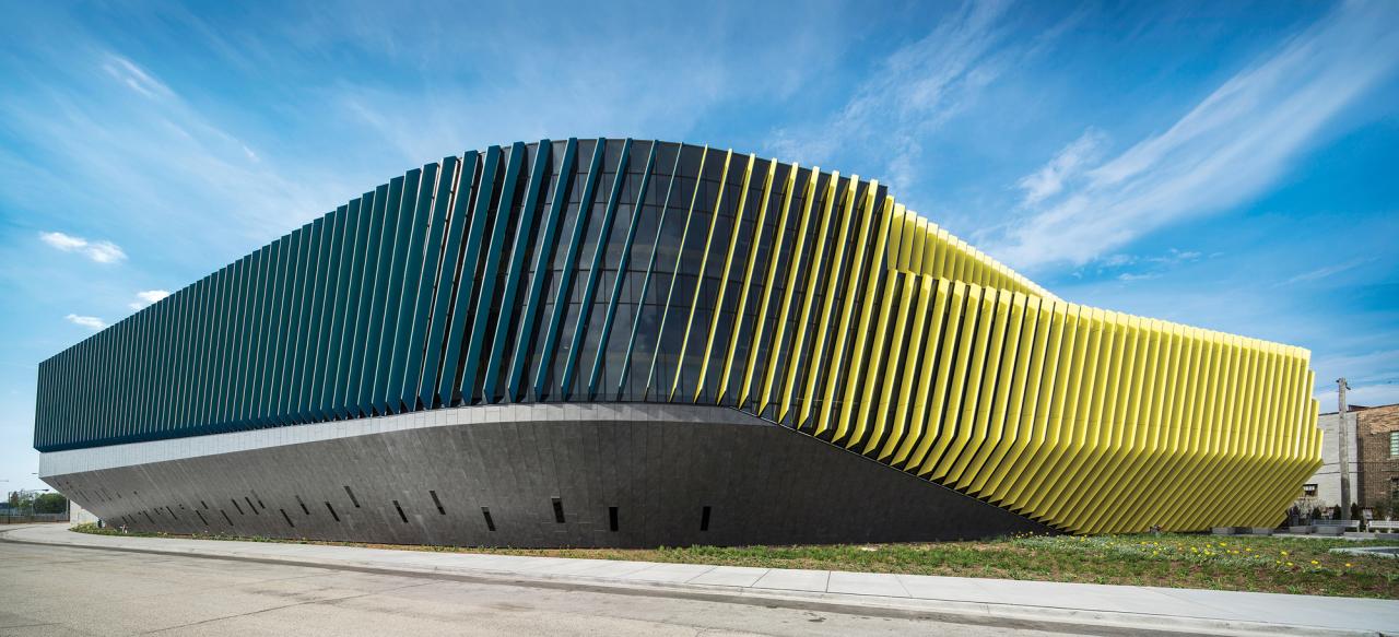
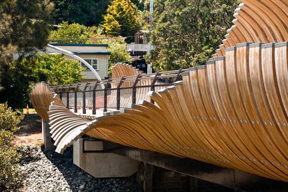
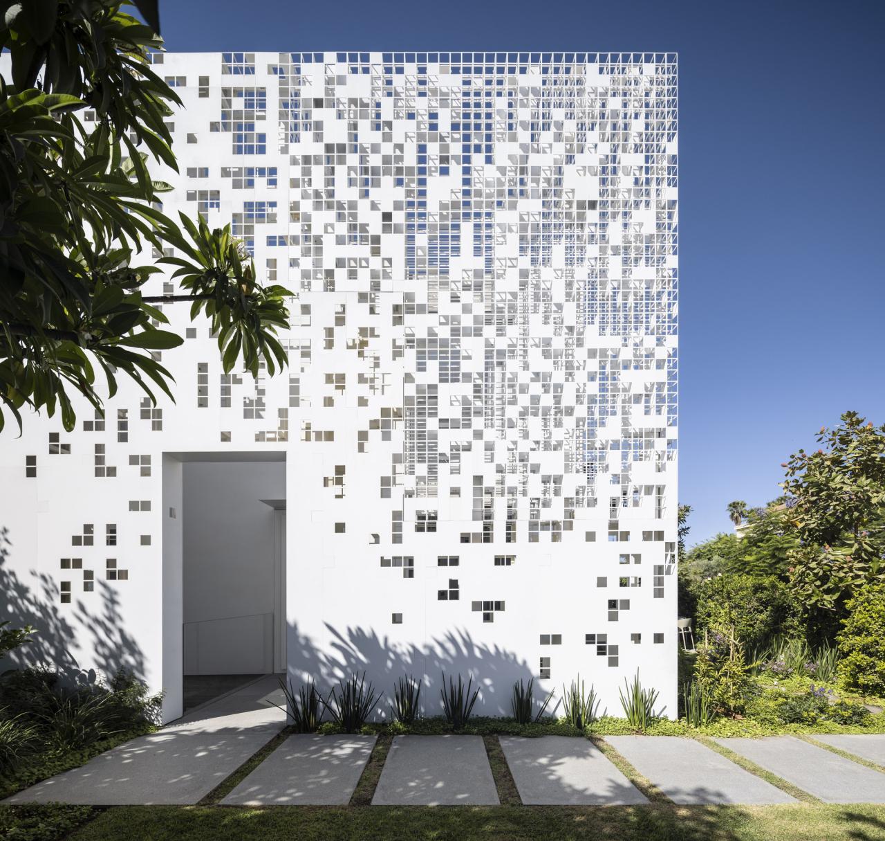
III. Interior Design and Architecture
In interior design and architecture, gradients are being used to manipulate perception, create atmosphere, and add dynamic visual interest to spaces.
A. Gradated Lighting: Intelligent lighting systems can produce seamless color gradients across walls, ceilings, or architectural features, creating dynamic moods, highlighting textures, or mimicking natural light cycles (e.g., sunrise to sunset).
B. Ombre Walls and Textiles: Walls painted with ombre effects or textiles featuring gradual color transitions add depth, softness, and a unique artistic element to interiors.
C. Tinted Glass and Paneling: Architectural elements like tinted glass facades or translucent panels can incorporate subtle color gradients, creating shifting light effects and a sense of depth from both inside and out.
D. Flooring and Surface Transitions: Using materials that gradually change color or texture across a floor or wall, creating a subtle visual pathway or delineating zones.
E. Projected Gradients: Advanced projectors can cast dynamic, changing gradients onto surfaces, transforming the ambiance of a room on demand without physical changes.
F. Material Blends: Using materials that naturally transition in color or texture, such as certain types of stone or wood, to create organic, subtle gradients within the space.
Gradients transform static spaces into dynamic, atmospheric environments that play with light, color, and perception.
IV. Fashion and Apparel
The fashion industry is embracing gradients to add fluidity, depth, and a vibrant sense of expression to garments and accessories.
A. Ombre Fabrics: Textiles featuring gradual color transitions, from subtle to bold, creating visually striking garments that convey movement and sophistication.
B. Digital Prints: Advances in digital textile printing allow designers to create incredibly intricate and nuanced gradients on fabrics, enabling unique patterns and artistic effects.
C. Layering and Transparency: Designers use sheer or translucent fabrics over solid colors or other gradients to create complex, layered visual effects that change with movement.
D. Accessory Highlights: Handbags, shoes, and jewelry featuring gradient finishes or materials that subtly shift in color, adding a touch of modernity and intrigue.
E. Hair and Makeup Trends: Ombre hair colors and gradient eyeshadow palettes mirror the design trend, bringing the aesthetic of smooth transitions to personal style.
F. Sustainable Dyeing Techniques: Innovation in low-impact or natural dyeing methods is allowing for the creation of beautiful gradients with reduced environmental impact.
Gradients in fashion add a sense of movement, artistry, and contemporary flair, allowing for bold and nuanced self-expression.
Innovations Powering the Gradient Comeback
The current sophistication and widespread adoption of gradients are largely due to significant advancements in technology and design tools.
A. Improved Software and Rendering Engines: Modern design software (e.g., Adobe Photoshop, Illustrator, Figma, Blender) offers highly precise controls for creating smooth, multi-stop gradients with a vast color gamut. Real-time rendering engines ensure these gradients display beautifully across all devices.
B. High-Resolution Displays and Color Fidelity: Retina displays, OLED screens, and wide-gamut monitors can render gradients with incredible smoothness, eliminating the “banding” (visible color steps) that plagued earlier digital gradients.
C. CSS Gradients and SVG Filters: Web technologies have evolved, allowing designers to create complex and responsive gradients directly in code (CSS) or through scalable vector graphics (SVG filters), ensuring fast loading times and adaptability.
D. Artificial Intelligence (AI) for Color Palettes: AI can assist designers by generating sophisticated and harmonious color palettes for gradients, suggesting unique transitions based on desired mood, brand guidelines, or trend analysis.
E. Generative Art Tools: AI-powered generative art tools can create dynamic and evolving abstract gradients that respond to parameters or real-time data, pushing the boundaries of algorithmic aesthetics.
F. Advanced Printing Technologies: Modern printing techniques (digital printing, direct-to-garment) can accurately reproduce complex digital gradients on physical products, packaging, and textiles with high fidelity.
G. Smart Lighting Systems: LED lighting technology with tunable white and RGB capabilities allows for the creation of dynamic, real-time gradients in architectural spaces, controlled via smart home systems.
These technological leaps have made gradients not just visually appealing but also technically feasible, versatile, and performant across all mediums.
Challenges and The Enduring Appeal of Gradients
While the comeback of gradients is strong, designers must navigate certain considerations, and their appeal is likely to endure.
A. Avoiding Overuse and Cliché: As with any popular trend, there’s a risk of gradients becoming ubiquitous or used without thoughtful intent, leading to a sense of visual monotony or datedness if not executed with originality.
B. Accessibility and Contrast: When using gradients as backgrounds or for text, designers must ensure sufficient color contrast for readability, especially for users with visual impairments. Dynamic testing for accessibility is crucial.
C. File Size Optimization: While improved, complex gradients, especially in raster formats, can still impact file sizes and loading times, requiring careful optimization for web and digital applications.
D. Maintaining Consistency Across Platforms: Ensuring gradients display consistently across different devices, screen types, and color calibration settings can be a challenge.
E. Branding Longevity: While trendy now, brands adopting bold gradients must consider if this aesthetic will remain relevant over their long-term branding strategy.
Despite these considerations, the allure of gradients is fundamentally strong and likely to persist.
F. Inherent Visual Dynamics: Gradients inherently add depth and movement, fulfilling a human desire for more dynamic and less static visual experiences.
G. Emotional Versatility: Their ability to evoke a wide range of emotions and set specific moods makes them incredibly versatile for diverse design applications.
H. Post-Minimalist Sophistication: Gradients offer a sophisticated alternative to pure flat design, providing visual richness without reverting to excessive ornamentation, appealing to a desire for nuanced aesthetics.
I. Connection to Nature: Many beautiful gradients are inspired by natural phenomena like sunsets, sunrises, and the ocean, tapping into our biophilic connection to the natural world.
J. Technological Enhancement: As display technology and rendering capabilities continue to improve, gradients will only become more seamless, vibrant, and visually compelling, ensuring their continued evolution and popularity.
Conclusion
The dynamic visual comeback of gradients is more than a fleeting trend; it’s a testament to their timeless power to add depth, emotion, and sophistication to our visual world. As designers continue to push boundaries and leverage new technologies, the future promises an even richer, more fluid, and captivating spectrum of gradient-infused aesthetics.


Discussion about this post