
Typography, the art and technique of arranging type, is often an understated yet profoundly powerful element in design. Far more than just choosing a font, it dictates readability, conveys emotion, establishes brand identity, and shapes the very aesthetic of our written world. In an age of digital screens, global communication, and diverse user needs, typography’s modern evolution is a fascinating journey of adaptation, innovation, and a return to fundamental principles. This comprehensive article delves into the dynamic transformation of typography, exploring its historical bedrock, its intricate interplay with technology, and its pivotal role in crafting compelling and effective design experiences across every medium. We’ll uncover how contemporary typographers are pushing boundaries while honoring the timeless craft of letterforms.
The Foundations of Typography
To appreciate typography’s modern journey, it’s essential to understand its rich historical roots, tracing back centuries before the digital age.
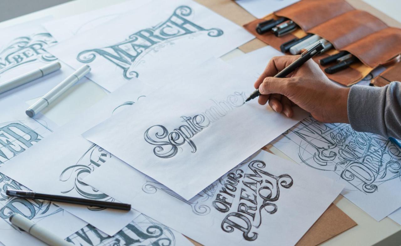
A. Early Script and Calligraphy: Before movable type, writing was primarily done by hand, with scribes painstakingly creating unique letterforms. These early scripts, from ancient hieroglyphs to medieval illuminated manuscripts, established the inherent artistic quality of written communication.
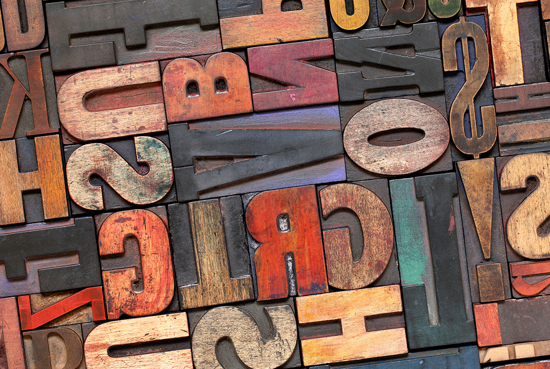
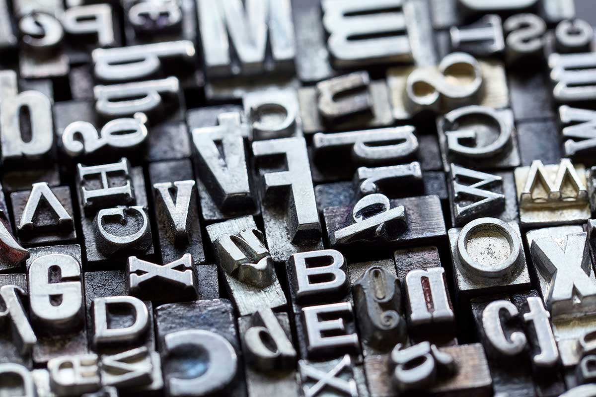
B. Gutenberg’s Revolution (15th Century): Johannes Gutenberg’s invention of the movable type printing press in the mid-15th century was a watershed moment. It standardized letterforms, enabled mass production of texts, and laid the groundwork for the systematic development of typefaces. Early typefaces often mimicked the calligraphic styles of the time.
C. Renaissance and Humanist Typefaces: The Renaissance brought a desire for clearer, more legible typefaces inspired by classical Roman inscriptions and humanist scripts. Typefaces like those by Nicolas Jenson set new standards for readability and elegance.
D. The Enlightenment and Transitional/Modern Typefaces: The 18th century saw the emergence of typefaces with greater contrast between thick and thin strokes and a more vertical axis, like those by John Baskerville and Giambattista Bodoni. These “modern” typefaces often felt more rational and less decorative.
E. Industrial Revolution and Display Typefaces (19th Century): The rise of advertising and mass communication fueled the creation of bolder, more attention-grabbing typefaces, including slab serifs, sans-serifs (initially seen as crude), and highly decorative display fonts for posters and headlines.
F. 20th Century Modernism and Simplification: The Bauhaus movement and designers like Jan Tschichold championed sans-serif typefaces (e.g., Helvetica, Univers) for their clarity, universality, and functional aesthetic. This era prioritized readability and minimal ornamentation, influencing corporate identity and wayfinding systems.
G. The Desktop Publishing Revolution (1980s-1990s): The advent of personal computers and software like Aldus PageMaker democratized type creation and usage. Suddenly, anyone could “typeset,” leading to an explosion of digital fonts, though not always with great design quality.
This historical lineage shows a constant interplay between technology, artistic expression, and the evolving needs of communication, setting the stage for typography’s truly modern evolution.
Key Aspects of Modern Typography
The digital age has profoundly transformed how type is designed, rendered, and consumed. This has led to a dynamic and multifaceted evolution in typographic practice.
I. Variable Fonts
One of the most significant recent innovations, variable fonts offer unparalleled flexibility and responsiveness.
A. Single File, Endless Variations: Unlike traditional fonts where each weight or style (e.g., Light, Regular, Bold, Italic) is a separate file, a variable font contains all variations within a single file. This drastically reduces file size and loading times for web and digital applications.
B. Continuous Design Space: Designers can fluidly adjust multiple axes of a typeface – such as weight, width, slant, optical size, and even serifs or other stylistic elements – along a continuous spectrum, rather than being limited to predefined weights.
C. Responsive Typography: This allows text to automatically adapt its appearance (e.g., getting bolder or wider) based on screen size, user preferences, or specific design needs, ensuring optimal readability across diverse devices.
D. Creative Potential: Designers can create dynamic animations where type morphs and changes its characteristics, or craft incredibly nuanced typographic hierarchies that were previously impossible.
E. Enhanced Performance: For web developers, reduced font file sizes lead to faster page loads, which is critical for user experience and SEO.
Variable fonts represent a paradigm shift, treating type not as static images but as fluid, responsive design elements.
II. Responsive Typography
Beyond variable fonts, the broader concept of responsive typography ensures text remains legible and aesthetically pleasing across all digital interfaces.
A. Fluid Sizing: Type scales gracefully with screen size, maintaining comfortable reading experiences from a small smartphone to a large desktop monitor. This involves units like vw (viewport width) or rem (root em) in web design.
B. Adjustable Line Height and Spacing: As text size changes, line height (leading) and letter spacing (tracking) are often adjusted proportionally to maintain readability and visual balance.
C. Optimized Layouts: Text columns, paragraph widths, and overall text blocks adapt to available screen real estate, preventing awkward line breaks or excessively long lines of text.
D. Dark Mode Adaptation: Typefaces need to be legible and comfortable to read in both light and dark modes, often requiring subtle adjustments to weight or color contrast.
E. User-Controlled Customization: Users increasingly expect to be able to adjust text size, contrast, and even font style, making accessibility a core component of responsive typography.
Responsive typography is crucial for universal access and ensures a consistent, high-quality reading experience in a multi-device world.
III. Expressive and Brand-Centric Typography
While legibility remains paramount, modern typography also serves a powerful expressive function, becoming a central pillar of brand identity.
A. Custom Typefaces: Many major brands commission bespoke typefaces, creating a unique typographic voice that differentiates them from competitors and reinforces their brand personality (e.g., Google’s Product Sans, Netflix Sans).
B. Typographic Logos: Logos composed entirely of distinctive typography (wordmarks) are common, relying on unique letterforms and careful kerning to create memorable visual identities.
C. Emotional Resonance: Specific typefaces can evoke feelings of trust, playfulness, sophistication, or modernity. Designers carefully select or craft type to align with the emotional tone of a message or brand.
D. Maximalist Typography: In contrast to minimalist trends, some designs embrace maximalist typography, using large, bold, and sometimes overlapping letterforms to create dynamic visual statements.
E. Animated Typography: Text comes alive with subtle animations, transitions, and dynamic effects, adding engagement and conveying meaning beyond static words in digital interfaces and motion graphics.
Modern typography isn’t just about conveying information; it’s about telling a story, evoking a feeling, and building a memorable brand identity through the sheer power of letterforms.
IV. Accessibility and Inclusivity
A critical aspect of modern typographic evolution is the strong emphasis on accessibility, ensuring that type is legible and usable for all individuals, regardless of their visual abilities or cognitive differences.
A. Readability Standards: Adhering to guidelines for minimum font sizes, sufficient color contrast between text and background, and appropriate line height and letter spacing to ensure readability for diverse users.
B. Dyslexia-Friendly Fonts: Designing or selecting typefaces that minimize common reading difficulties for individuals with dyslexia, often characterized by distinct letter shapes and generous spacing.
C. User Customization: Allowing users to adjust text size, font choice (e.g., opting for a sans-serif for clarity), and contrast settings within interfaces.
D. Screen Reader Compatibility: Ensuring that text is properly structured and tagged so that screen readers can accurately interpret and vocalize content for visually impaired users.
E. Legibility in Diverse Contexts: Considering how type will perform under various conditions, such as low light, motion (on screens), or when viewed from a distance (signage).
Accessible typography is a cornerstone of inclusive design, recognizing that effective communication must be universally available.
V. Global and Multi-Script Typography
As digital communication transcends geographical boundaries, modern typography is increasingly focused on supporting diverse languages and scripts.
A. Unicode and Font Encoding: The widespread adoption of Unicode has standardized how characters from virtually every writing system are encoded, allowing a single font file to support multiple languages.
B. Internationalization and Localization: Designing typefaces that not only support different scripts (e.g., Latin, Cyrillic, Arabic, Devanagari, Han) but also respect their unique typographic traditions, cultural nuances, and reading directions.
C. Variable Font Potential for Multi-script: Variable fonts can potentially house multiple scripts within one file, offering consistent design parameters across different linguistic contexts.
D. Open-Source Typefaces: The growth of open-source initiatives (e.g., Google Fonts) has made high-quality, globally supported typefaces widely accessible, fostering typographic diversity online.
E. Cross-Cultural Readability: Designers must consider how different language characteristics (e.g., word length, character complexity) influence optimal line length, line height, and overall layout.
Global typography is a complex yet vital field, ensuring that the beauty and functionality of type can bridge linguistic and cultural divides.
Tools and Techniques Driving Typographic Innovation
The relentless march of technology provides the fertile ground for typography’s modern evolution, from design tools to rendering engines.
A. Advanced Font Creation Software: Tools like FontLab, Glyphs, and RoboFont offer sophisticated features for designing intricate letterforms, managing kerning pairs, creating OpenType features, and now, authoring variable fonts.
B. Web Fonts and CDN Services: Services like Google Fonts and Adobe Fonts have democratized the use of high-quality web fonts, making a vast library of typefaces readily available for web designers without complex self-hosting.
C. GPU-Accelerated Text Rendering: Modern operating systems and browsers leverage graphics processing units (GPUs) to render text with incredible clarity, smoothness, and anti-aliasing, ensuring sharp display at any size.
D. OpenType Features and Glyphs: Advanced OpenType features allow typographers to embed sophisticated typographic behaviors directly into font files, such as ligatures, stylistic alternates, small caps, old-style figures, and contextual substitutions.
E. Artificial Intelligence (AI) and Machine Learning (ML):
* Automated Font Generation: AI can assist in generating initial letterform variations or even entire typefaces based on parameters or existing styles, speeding up the design process.
* Kerning and Spacing Optimization: ML algorithms can analyze text and optimize kerning and tracking for improved visual balance and readability across different contexts.
* Typographic Recommendation Engines: AI can suggest optimal font pairings or typographic styles based on project briefs, target audience, and desired mood.
* Handwriting to Font Conversion: AI is enabling more accurate and efficient conversion of handwritten text into digital fonts.
F. Augmented Reality (AR) and Virtual Reality (VR) Typography: Type in AR/VR environments presents unique challenges and opportunities, requiring consideration of depth, perspective, motion, and interaction within 3D spaces. Innovations in spatial typography are emerging.
G. Interactive and Dynamic Displays: From large-scale architectural projections to dynamic digital signage, typography is being designed to be interactive, responsive to environment, and animated, creating immersive visual experiences.
These technological advancements are not just making typography easier to produce but are also enabling entirely new forms of typographic expression and interaction.
The Future of Typography
Typography’s evolution is ongoing, promising even more dynamic, intelligent, and integrated experiences in the years to come.
A. Hyper-Personalized Typography: Imagine interfaces where typefaces automatically adjust not just to screen size but also to your personal reading speed, cognitive preferences, or even mood, creating a truly bespoke reading experience.
B. Voice and Conversational Typography: As voice user interfaces (VUIs) become more prevalent, the “typography” of conversation—how tone, emphasis, and pauses are conveyed in text-to-speech or text-based chat—will become increasingly sophisticated.
C. Data-Driven Typography: Typefaces and layouts could dynamically change based on the data they are presenting, highlighting patterns or anomalies in a visually intuitive way within dashboards and data visualizations.
D. Sustainability in Type Design: Considering the “energy footprint” of font files, optimizing for efficient rendering, and perhaps even creating typefaces that encourage more sustainable reading habits.
E. Integrated Typographic Ecosystems: A seamless integration of typography across all touchpoints of a brand – from physical products to digital interfaces, advertising, and even spatial design – ensuring a cohesive and compelling brand voice.
F. Adaptive and Ambient Typography: Type that responds to its environment—changing color, size, or form based on light conditions, proximity sensors, or even audience demographics in public spaces.
G. The Blurring Lines of Type and Image: Typography will increasingly meld with imagery and motion, becoming a fluid visual element rather than a static block of text, especially in immersive digital experiences.
Conclusion
Typography’s modern evolution is a testament to its enduring power as a fundamental communication tool and a vital artistic medium. As technology continues to advance, the boundaries of what type can achieve will only expand, ensuring that the silent language of letterforms continues to speak volumes in our ever-changing world.


Discussion about this post